McGoldrick & Paul Electric
I was approached with the task of rebranding and creating a website for local electricians who were launching their business. The first approach was learning about the services they provide, and what kind of audience they were targeting, which included both residential and commercial clients. I started looking up local companies and found a lot of royal blue, bright yellows, and some reds, cartoonish script fonts, heavily worded websites that were hard to navigate, and no real idea of who you were calling to come to your home or business.
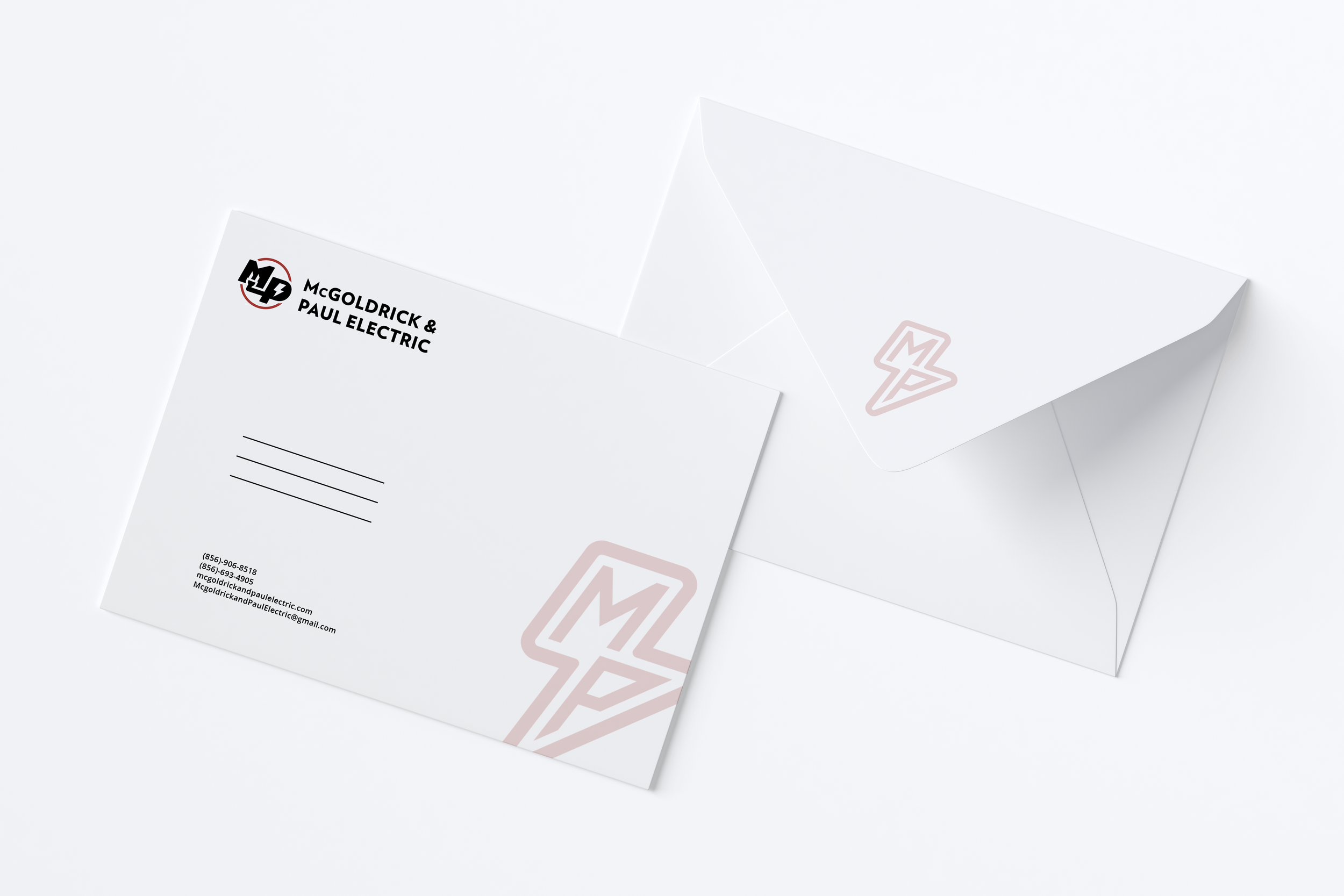
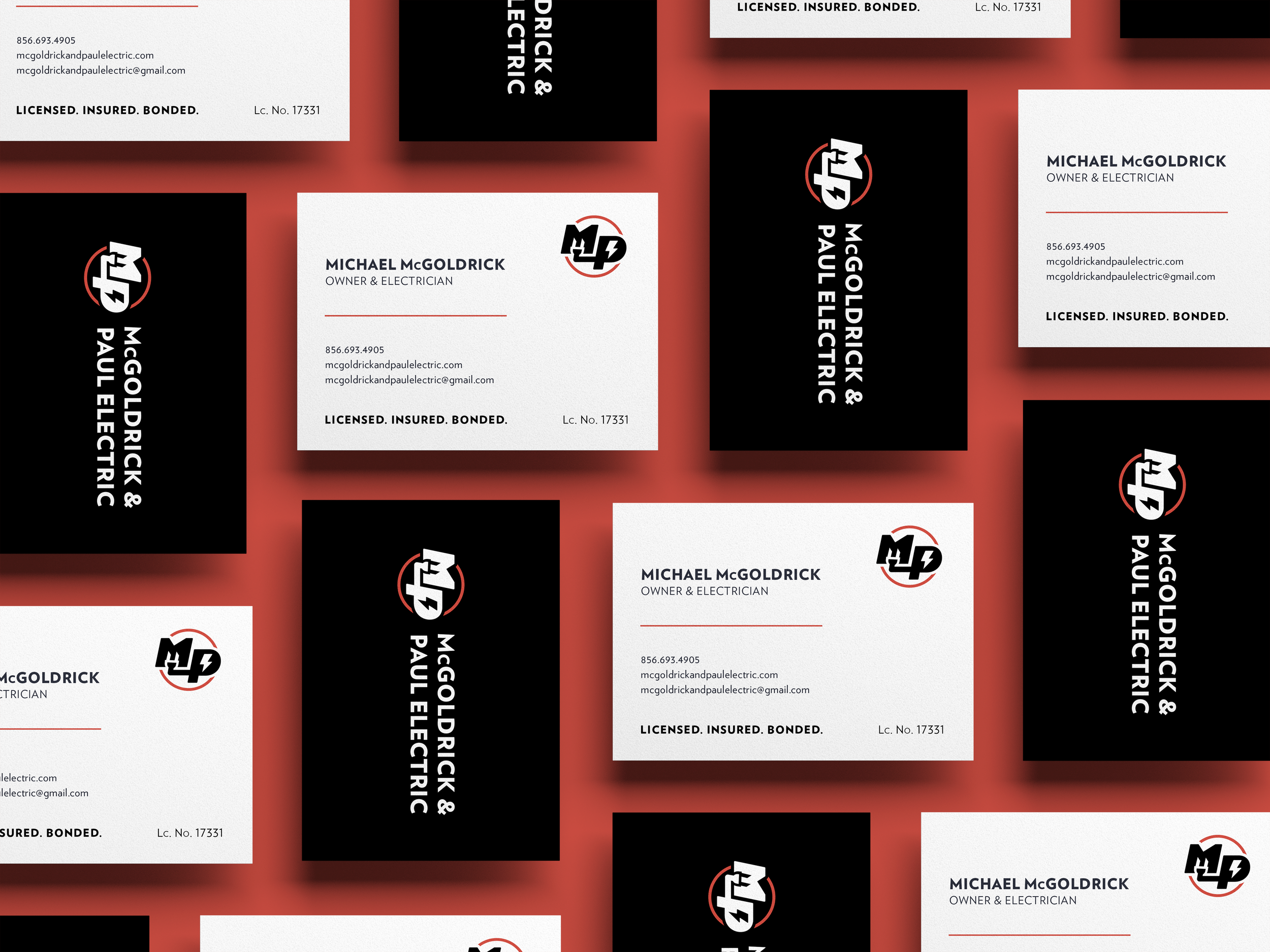
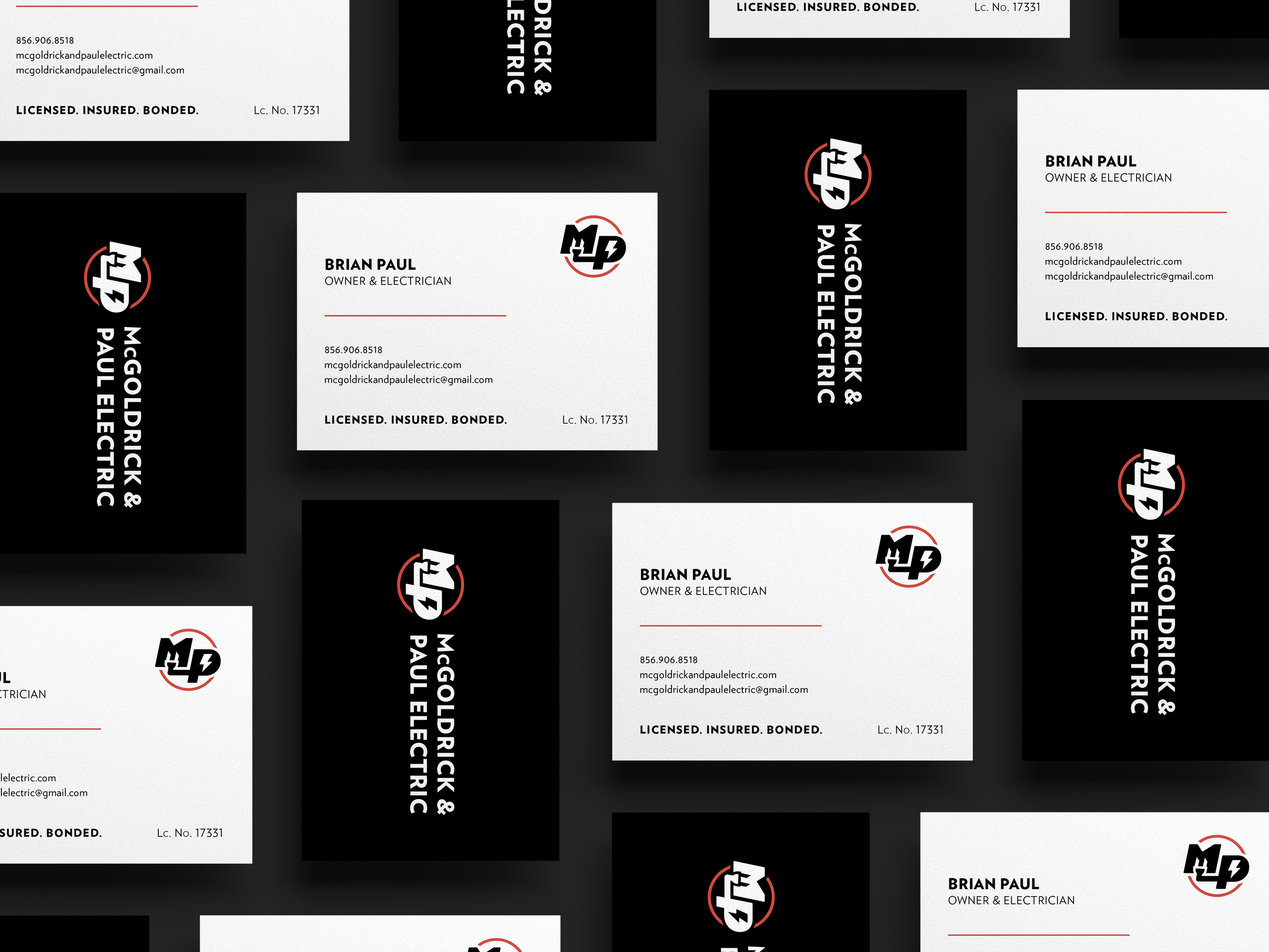
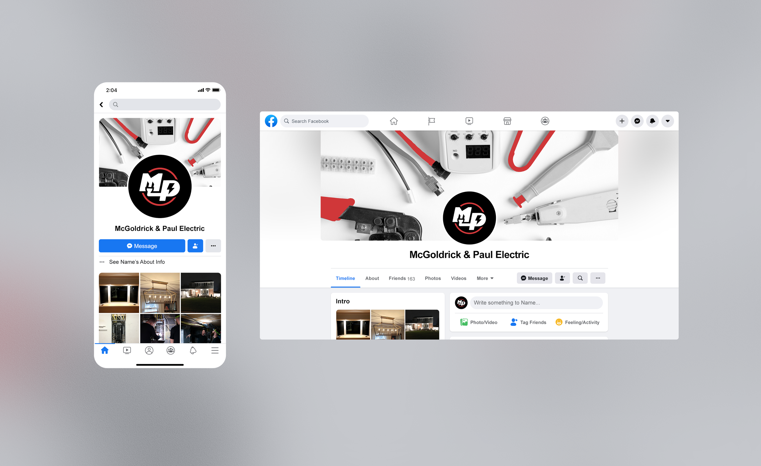
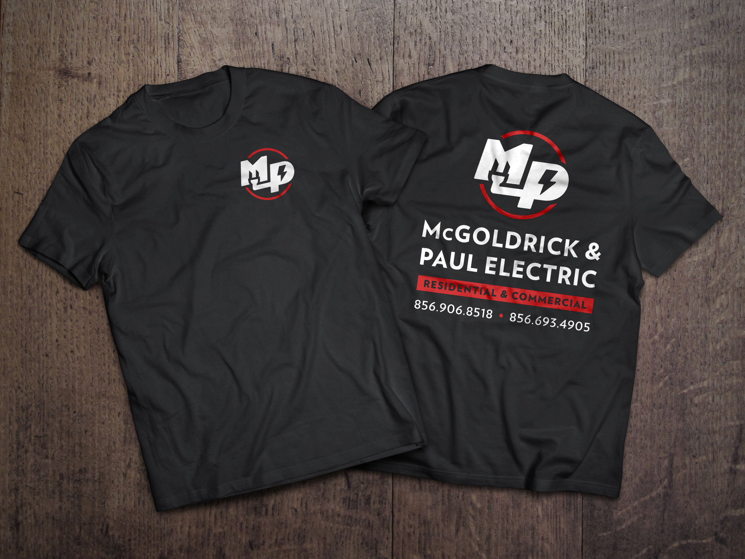
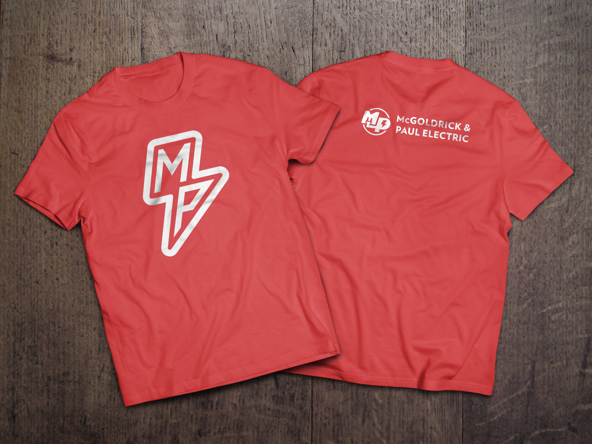
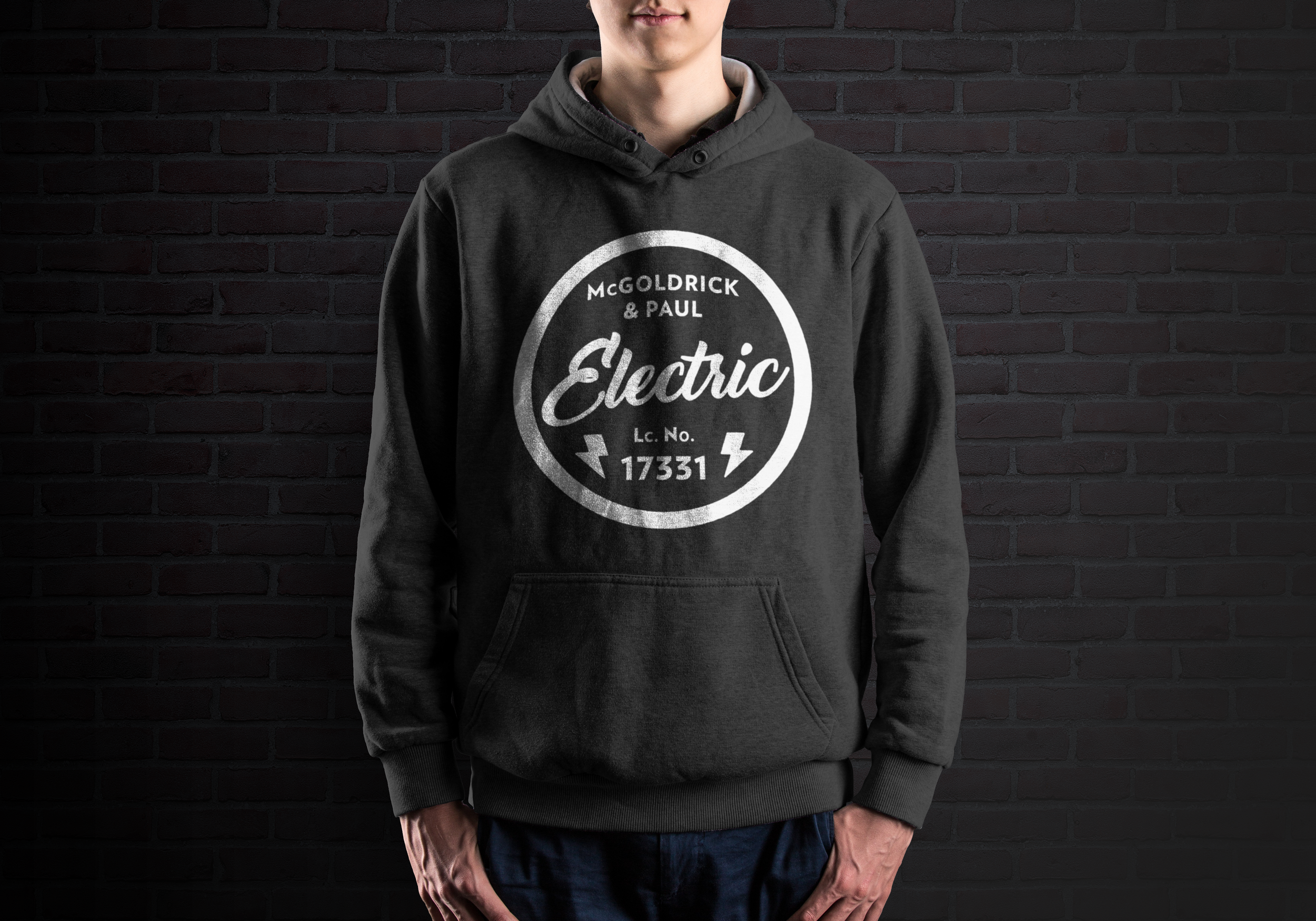
Since the name was settled, but they were open to ideas as far as the logo and colors, we had an exchange of ideas and sketches, falling on the MP monogram with the outlet plug and lightening bolt, along with the red, black, and white color palette. We ended up keeping a few of the runner up logos to be used as secondary and alternative options for use at their discretion. Both of the owners are big basketball fans, and the idea of the secondary logo came from the NBA and how they use their supporting artwork on shorts, limited edition shirts, etc. We wanted to have the same flexibility for MPE, and ended up keeping the circle with script, and the lightening bolt MP (both below) as alternates. For the text, we went with a sans serif font with capital and spaced letters for legibility, and easy recognition, balancing out the text to the right with the image on the left.
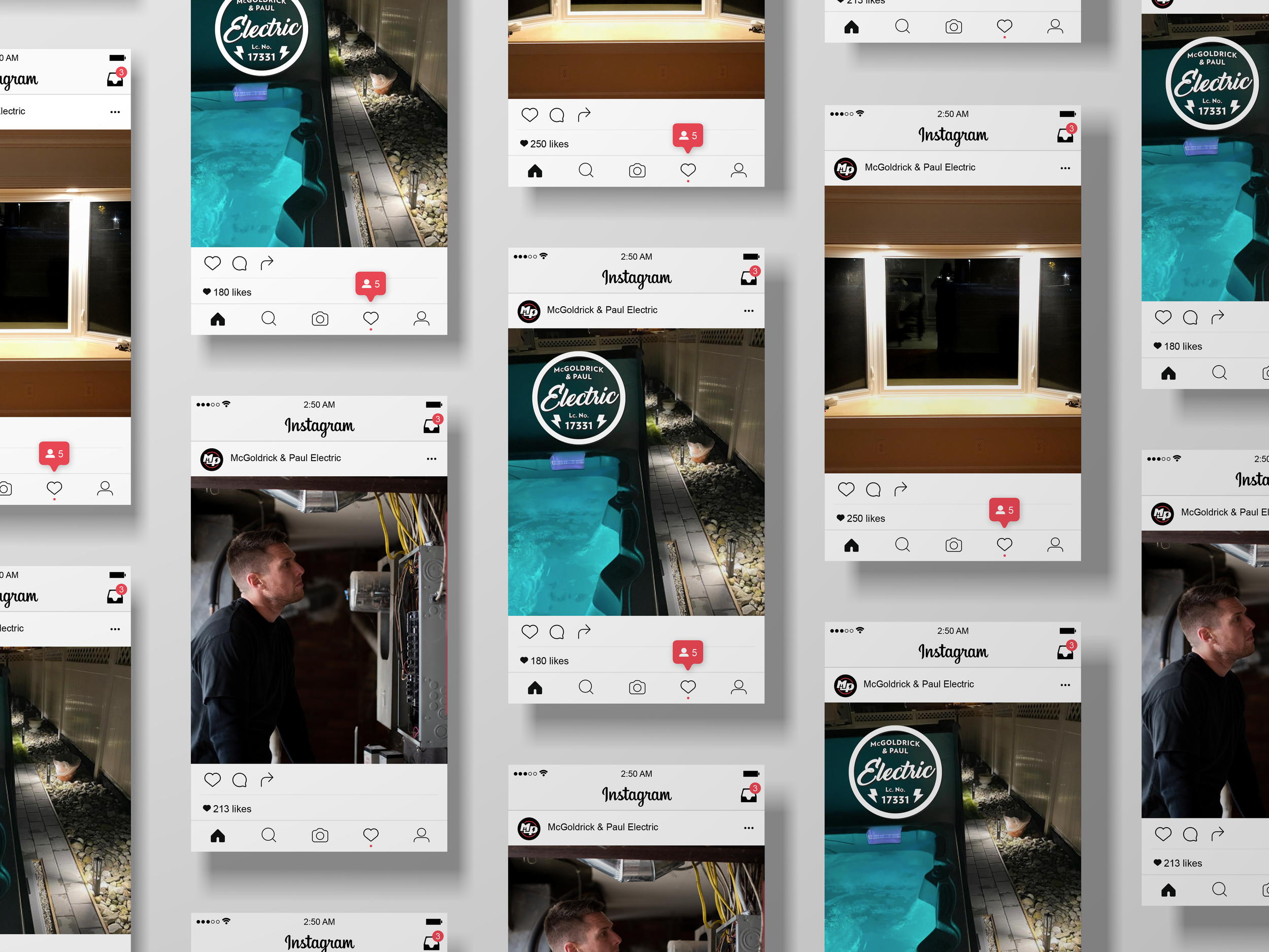
The website was created with a top-down approach, showing you an example of their work paired with the tagline, scrolling down quickly shows you the services they provide for both the residential and commercial sectors. Immediately following the services is the “About Us” section, where I had the idea of featuring their headshots, names, and a blurb about their qualifications. This was followed by testimonials, an extended gallery, and the contact section. After the website was launched, I was told that they receive a lot of positive feedback around the “About Us” section, and how customers appreciate being able to put a face to their contractor prior to meeting.
Overall, we wanted to create a brand that navigates the waters between modern, reliable, and dependable. A brand that shows professionalism and quality, owning their space in the industry while remaining true to their personal tastes.